Photography
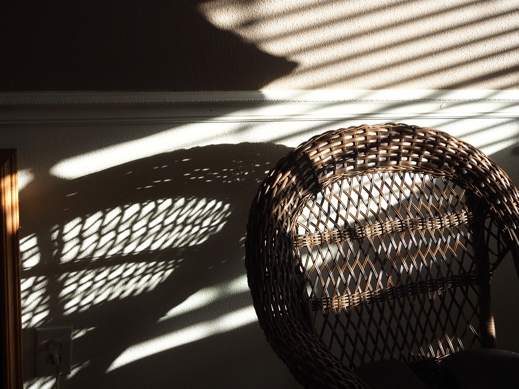
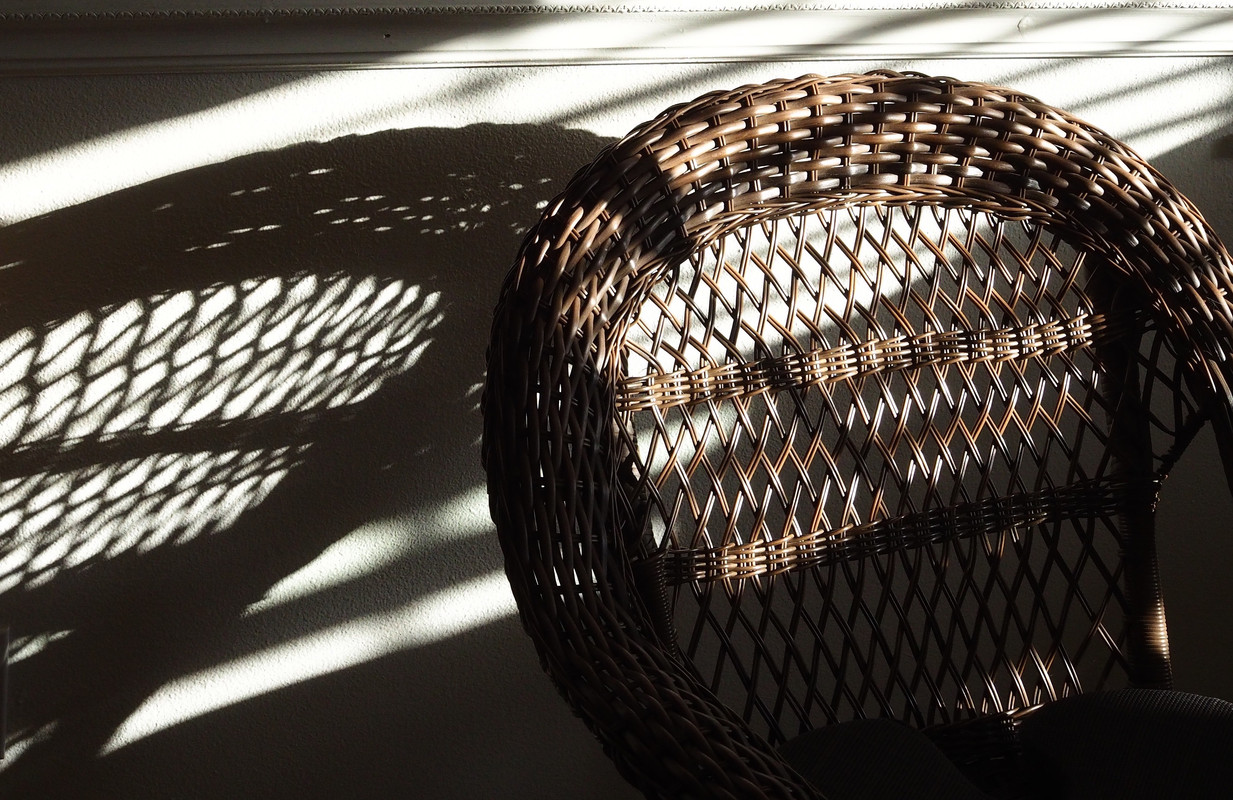
Related: About this forumWicker Chair Shadow -- Can't decide--do you like one or the other, or both or neither? Thanks!


FalloutShelter
(14,132 posts)I like it better because the piece of wood trim on the left is cropped out. I think that the trim and its' shadow confused the geometry.
If that make sense.
![]()
EarthAbides
(413 posts)And the wall socket is not there in the second one.
George McGovern
(10,645 posts)EarthAbides
(413 posts)The chair is more visible.
George McGovern
(10,645 posts)Tadpole Raisin
(1,889 posts)improves the perspective for me.
![]()
George McGovern
(10,645 posts)Tadpole Raisin
(1,889 posts)was always fascinated by perspective in a shot. Although it’s been years I’m still drawn to not just the item shot but the relationships within the frame.
I appreciate your artistry!
George McGovern
(10,645 posts)mwmisses4289
(3,077 posts)Too much dark in the first one for me.
They are both beautiful pics, though.
George McGovern
(10,645 posts)"too much dark" may not be an especially good thing in life.
ShazzieB
(22,137 posts)Last edited Sat Jun 28, 2025, 07:58 PM - Edit history (1)
Both are interesting to look at, but in the end, my eye is more drawn to #2.
George McGovern
(10,645 posts)Easterncedar
(5,402 posts)I thought I preferred one, then looked harder and can’t decide. The strong parallel lines above versus the brighter basket weave below…. Oh those elegant details!
George McGovern
(10,645 posts)usonian
(23,239 posts)Big dark area and slats dominate the first.
Nondescript composition. Two pictures in one.
Second is "focused." and has diagonal composition.
George McGovern
(10,645 posts)anciano
(2,144 posts)Less cluttered.
George McGovern
(10,645 posts)LoisB
(12,215 posts)but maybe that takes the focus off the chairs a little. At least to my ancient eyes.
George McGovern
(10,645 posts)LoisB
(12,215 posts)mopinko
(73,246 posts)George McGovern
(10,645 posts)Diamond_Dog
(39,627 posts)Something about the wall space above the chair and shadow in the first one doesn’t work as well for me as the bottom photo.
Pretty neat capture!
George McGovern
(10,645 posts)DUU
(80 posts)George McGovern
(10,645 posts)GiqueCee
(3,290 posts)... the shadows above the chair rail are extraneous and distracting from the superior composition below.
George McGovern
(10,645 posts)Phoenix61
(18,682 posts)The dark at the top left corner draws your attention away from the chair and its shadow.
George McGovern
(10,645 posts)wyn borkins
(1,372 posts)I also suggest (a possible) re-shoot to improve composition and lighting
(1) Raise window blinds to eliminate extraneous horizontal shadowing
(2) Add more chair (in frame) to improve rationale for overall (chair/shadow) image effect
(3) Focus on chair and it's reflection on backwall with millwork. Your second image nicely displays chair just below millwork and decent amount of wall area just above millwork
(4) Perhaps reposition chair in incoming light for improved chair/shadow effect
(5) For a different presentation, maybe try to focus on the shadow while leaving the chair in slight blur
These are only suggestions - only suggestions - only suggestions. Your friend, Wyn